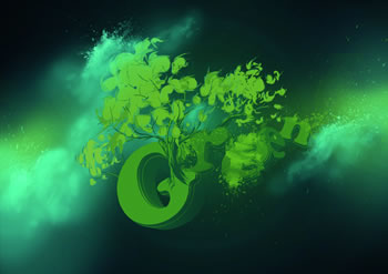
Creating your own elements can be very useful when illustrating - not only does it reduce your need for external resources, but it also contributes to an original outcome that represents you, the designer.
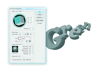
01. To begin, open Illustrator and create a new web document. Type in the letters individually, using a light grey as foreground colour (colour reference #b9b9b9). Go to Effect > 3D > Extrude and Bevel. Use a 35 perspective and a Complex 2 Bevel. Depending on your font size, you should alter the Extrude Depth and Bevel Height values, so that the letters don't show any distortion.
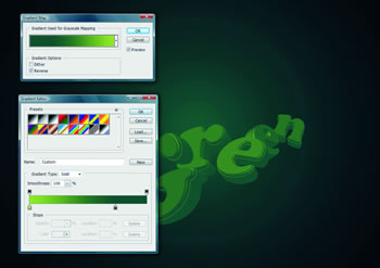
02. In Photoshop, create a new A3 document at 300dpi. Paste in the letters as a Smart Object and add a Gradient Map Adjustment Layer with these colours: #a3bd41 and #124938. Add a Curves Adjustment Layer and darken it slightly.
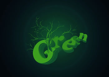
03. Now we'll add some trees. I recommend using a graphics tablet for this task, as pressure sensitivity is highly useful here. Use strokes that alternate between soft and hard pressure, so that the lines fade in and out in thickness. Use the same colors found in the Gradient Map used earlier to create a background and foreground color for the trees.
04. Add foliage on the trees in the same way, but with a considerably larger brush. After creating the main body of the leaves, add subtle accents with a small brush, identical in size to the trunk's lines.
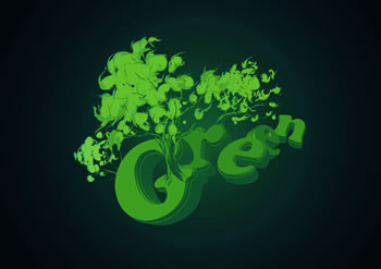
05. On a separate layer, draw more accents, but with different colours. Use a slightly darker green for the shadows, and a light cyan for reflected light. Bear in mind where your light source should be at all times, using the shading on the letters, and make sure that all the highlights coincide.
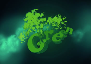
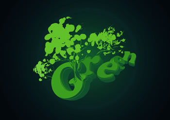
06. Use a tablet if you can for the clouds, as pen pressure is important here. Select a soft, round brush at low opacity (somewhere between 10 and 20 per cent) and press hard to gradually create the main body of the clouds, on a layer behind the letters.
07. Because you're using a low opacity, the more often you touch the tablet (or click the mouse), the more solid the colour will become, so use increasingly less pressure to eventually define the edge of the cloud on only one side - the top. Use reference images or real clouds to make sure your cloud remains as realistic as possible.
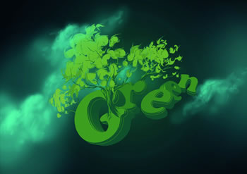
08. Now download Bittbox's free splatter brush set from this URL: www.tinyurl.com/2a6yvq. Use a couple of the brushes to add some colour intensity to the highest points of the clouds. Keep the splatter's colour identical to the tip of the clouds. Erase unneeded portions and make sure they keep the same orientation as the other elements.
09. Using the same technique, apply some more splatters to the letter's faces. I suggest using one on the first, third and fifth letter, so that the area doesn't become cluttered. Also, add two soft shades of green with a large, soft brush behind the clouds. We're doing this to chromatically balance the composition.
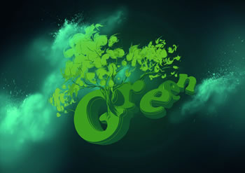
10. Now it's time to add a texture. However, rather than adding a photo with a blending mode, we'll apply only certain parts of a given texture. Download the watercolour texture image available for free from stock.xchng from this URL: www.tinyurl.com/65neat. Bump up its contrast by a hefty amount using a levels adjustment layer.

11. Go to Select > Color Range > Midtones. Since the texture has a very high contrast, you should be selecting only small portions of the image. Create a new layer and fill the selection with green (36592e). Set the layer's opacity to 30% and hide the image's layer.
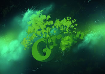
12. Repeat the same process to create another texture layer with a different colour (#669996), but rotate the image this time, and play around with the contrast to make the lines thinner. Leave this layer's opacity at 100% after filling the selection in another layer.

13. As a final touch, add some bird shapes from Bittmap's freely downloadable pack, www.tinyurl.com/5dczvs, to the landscape. Add four similar ones, and position them horizontally as to make them look as though they're flying around the trees. Use them as an opportunity to add variation to the design with a bold orange colour, and add a few highlights to their wings.
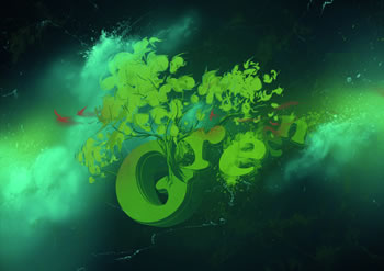
14. Now use a soft brush with the pressure sensitivity enabled to draw streams that suggest the birds' motion. Also, make a selection of the letters' faces and fill them with similar shades of green. I gave the 'r' and first 'e' a more intense colour, and added an orange reflection through a clipping mask.
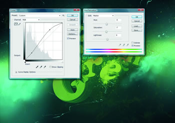
15. Add some contrast to the image by adding a Curves and Hue/Saturation Adjustment Layer. Because the curves will also intensify the colour, drag the Saturation bar to -7 and change the Hue to -5.
Tidak ada komentar:
Posting Komentar